Communication Health Dashboards: Metrics for Couples
Most couples can tell you whether their relationship feels good or bad on a given day, but almost none of them can tell you why — or whether today is better or worse than last month. Feelings are honest but blurry. A communication health dashboard fixes that: it turns vague impressions (“we’ve been snapping at each other lately”) into a small set of observable relationship communication that you and your partner review together, the way you might review a household budget. The goal is not to grade each other. It is to spot drift early, celebrate what is working, and give your conversations a shared, calm language.
This guide explains what a communication health dashboard is, which metrics actually predict relationship quality according to published research, how to build a simple dashboard with a 20-minute weekly check-in, and how modern AI-assisted tools can support the process without turning your partnership into a surveillance project.
What a Communication Health Dashboard Actually Is
A dashboard is simply a one-page summary of the numbers that matter. Businesses use them to track revenue and churn; couples can use them to track the patterns that researchers have linked to long-term relationship satisfaction: how often partners turn toward each other instead of away, how quickly they repair after conflict, the balance of positive to negative exchanges, and how safe each partner feels raising difficult topics.
The idea has roots in two well-known lines of relationship research. First, decades of observational studies by Dr. John Gottman and colleagues showed that stable couples maintain a ratio of at least five positive interactions for every negative one during conflict — a finding often called the “magic ratio.” Second, therapists have long used structured questionnaires and self-report scales to measure things like communication frequency, conflict resolution efficacy, and satisfaction levels. A dashboard combines these insights into something practical: a handful of metrics, scored regularly by both partners, displayed side by side so trends become visible.
You do not need special software. A shared note, a spreadsheet, or a dedicated couples app all work. What matters is consistency: the same metrics, scored the same way, on the same schedule, with both partners participating.
The Core Metrics Panel: Eight Numbers Worth Watching
Below are eight metrics that cover the full territory — what researchers assess when they study communication health, translated into plain language you can score at home. Each partner scores each metric from 1 to 10 (1 = poor, 10 = excellent) during your weekly check-in, and you record both numbers.
| Metric | What it measures | How to score it (1–10) | Healthy benchmark |
|---|---|---|---|
| 1. Positivity ratio | The balance of positive to negative exchanges during disagreements | After a recent conflict, estimate: were there roughly five warm, humorous, or validating moments for every critical or defensive one? | 5:1 or better during conflict; closer to 20:1 in everyday life, per Gottman’s research |
| 2. Repair speed | How quickly you de-escalate and reconnect after a rupture | Think of your last argument: how long until someone made a genuine repair attempt (apology, humor, affection)? Minutes score high; days score low. | Repair attempts within hours, not days |
| 3. Bid response rate | How often small bids for connection get a warm response | Bids are the little moments — “look at this,” a touch on the arm, a sigh that asks for comfort. Estimate the percentage you each “turn toward” rather than ignore. | Turning toward bids most of the time (roughly 8 in 10 or more) |
| 4. Listening quality | Whether each partner feels genuinely heard | Ask: “When I spoke about something that mattered this week, did you feel I listened to understand rather than to reply?” Score the felt experience, not the intention. | 7+ for both partners |
| 5. Difficult-topic safety | How safe it feels to raise hard subjects | Rate your confidence that raising a concern would be met with curiosity rather than anger, withdrawal, or defensiveness. | 7+ for both partners; a large gap between partners is itself a warning sign |
| 6. Conflict completion rate | Whether disagreements get resolved or shelved | Count recent conflicts: what share ended with a clear resolution or agreed next step, versus fading into silence or erupting again later? | Most conflicts reach closure; repeat arguments about the same issue stay rare |
| 7. Appreciation frequency | How often gratitude and admiration are expressed | Count specific appreciations voiced this week (not just felt). “Thanks for handling the school run when I was exhausted” counts; a vague “you’re great” counts less. | Several specific appreciations per week, from both partners |
| 8. Nonverbal warmth | Body language, tone, and physical affection outside conflict | Rate the week’s tone: eye contact, relaxed posture, affectionate touch, warm tone of voice — the nonverbal channel that carries more weight than words. | Consistently warm; cold or tense stretches are brief and repaired |
Eight metrics may sound like a lot, but scoring takes about two minutes per person once you are used to it. Start with the four that matter most — positivity ratio, repair speed, bid response rate, and difficult-topic safety — and add the rest after a month. Depth beats breadth; a dashboard you actually maintain is infinitely better than a perfect one you abandon.
How to Read Your relationship communication Like a Pro
Collecting numbers is the easy part. Interpreting them well is where the dashboard earns its keep. Four reading principles separate a useful dashboard from a source of new arguments.
1. Direction matters more than level
A listening score of 6 is not good or bad in isolation. A listening score that has fallen from 8 to 6 over three weeks is a signal — something changed, and it is worth a curious conversation before it falls further. Professionals who track client relationships follow the same principle: they watch the direction between consecutive readings rather than any single absolute number. Set a personal rule: any metric that moves two or more points in either direction over a month earns a dedicated discussion.
2. Separate leading from lagging indicators
Lagging indicators tell you what already happened — satisfaction scores and conflict completion rates fall into this group. Leading indicators warn you about what is coming: bid response rate and difficult-topic safety typically deteriorate before satisfaction drops. When your leading indicators dip while lagging ones still look fine, treat it as an early warning, not a false alarm. That is the entire point of a dashboard: to catch the smoke before the fire.
3. Watch the transparency delta between partners
Record both partners’ scores separately and look at the gap. If one partner rates listening quality an 8 and the other rates it a 4, the gap of 4 is the most important number on the page. Large perception gaps mean the two of you are living in different relationships — one partner feels heard while the other feels invisible. The metric to improve is not the average; it is the delta. A smaller gap with lower absolute scores is often healthier than high scores that only one partner believes in.
4. Treat one bad week as noise, four as a pattern
Illness, work deadlines, a sick child, or a bereavement will tank every metric at once. That is not a relationship problem; it is a life problem, and the dashboard should reflect it without triggering alarm. Note the external stressor on the dashboard itself (“week of the flu — scores expectedly low”) and look for recovery when the stressor passes. Only a sustained decline across four or more weeks, without an external explanation, warrants deeper intervention — possibly with a couples counselor.
Building Your Dashboard: A 20-Minute Weekly Check-In Ritual
The dashboard lives or dies on the ritual that feeds it. Here is a simple structure, borrowed from couples therapy practices like a structured weekly emotional check-in, that keeps the conversation warm instead of bureaucratic.
Step 1 — Appreciations first (5 minutes)
Each partner names two specific things the other did this week that they appreciated. This is not filler; it deliberately front-loads positivity and makes the rest of the conversation safer. Be concrete: “I appreciated that you took over bedtime on Thursday when my presentation ran late” lands far better than “thanks for everything.”
Step 2 — Score the metrics (5 minutes)
Separately, silently, each partner scores the week’s metrics from 1 to 10 and writes them down. Score first, discuss after — this prevents one partner’s number from anchoring the other’s. Then read the numbers aloud and note the deltas.
Step 3 — Discuss one metric, not all eight (7 minutes)
Pick the metric with the largest partner gap or the steepest decline, and discuss only that one. Use a simple script: “I scored listening a 5 because when I talked about my mother on Tuesday I felt you were scrolling. What was your experience?” Listen, reflect back what you heard, and agree on one small experiment for next week — for example, phones face-down during the evening wind-down. One experiment beats five resolutions.
Step 4 — Close with repair and warmth (3 minutes)
End by naming one thing you will each do differently and one thing you are looking forward to together. If the conversation got tense, this is the moment for ready-made de-escalation phrases like “We’re on the same team here” or “Can we pause and restart this one?” Never end a check-in mid-argument; if you cannot resolve it in the time available, schedule a specific time to return to it rather than letting it fester.
AI-Assisted Tools That Can Support Your Dashboard
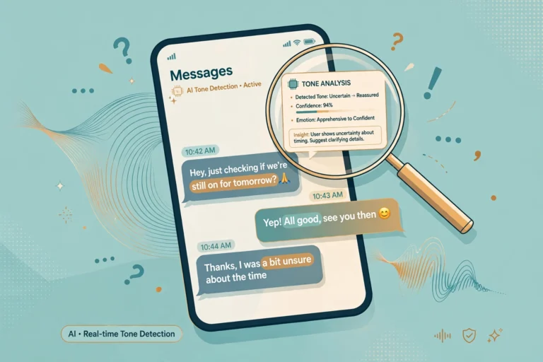
This is where the “AI Communication Tools” category earns its place. A new generation of apps can passively or actively support communication tracking — sentiment analysis of your shared journal entries, prompts that remind you to log appreciations, or tools that analyze messaging patterns between partners (such as response latency or the ratio of questions to statements) and reflect the trends back to you. Used well, these tools do the tedious parts of dashboarding: they remember what you forget and surface patterns you cannot see from inside the relationship.
Two guardrails are non-negotiable. First, consent must be explicit and mutual. Both partners opt in, both can see everything the tool collects, and either can pause it at any time. Analyzing a partner’s messages without their knowledge is surveillance, not self-improvement, and it corrodes exactly the trust your dashboard is meant to build. Second, prefer tools with strong privacy practices — end-to-end encryption and local-first data storage. If you are choosing where to have sensitive conversations, consider private, encrypted messaging options for couples rather than platforms that mine message content for advertising.
AI is best treated as a mirror, not a judge. A useful prompt to give any tool: “Show us our trends, not our verdicts.” The moment an app starts assigning blame or scores to a partner, it has stopped helping.

Red Lines: When Tracking Does More Harm Than Good
Metrics are powerful, which means they can be weaponized. Watch for these failure modes and stop tracking immediately if any of them appear:
- Scorekeeping as ammunition. “Your listening score was 4 last month, so you don’t get to complain” turns the dashboard into a courtroom exhibit. The rule: numbers may be used to start curious conversations, never to win arguments or assign guilt.
- Metric gaming. If a partner starts performing appreciations purely to move a number, the metric has replaced the thing it measured. When scores look suspiciously perfect while the relationship feels strained, trust the feeling and discuss the gap.
- Anxiety and rumination. Checking the dashboard daily, or catastrophizing a single low score, converts a helpful tool into a stressor. Weekly scoring is the maximum useful cadence for most couples; monthly is fine too.
- Using data to avoid therapy. A dashboard is a complement to professional help, not a replacement. If conflict completion stays low for two months, if difficult-topic safety scores stay under 4, or if any form of contempt, intimidation, or control appears, the Gottman Method and other evidence-based approaches work best with a trained therapist guiding them — bring your dashboard to the sessions, where it becomes genuinely useful clinical context.
Finally, remember that emotional safety builds the trust that supports desire across every dimension of a partnership. The dashboard’s deepest purpose is not the numbers at all — it is the weekly proof that both partners are willing to look honestly at the relationship and work on it together. That willingness is the metric that matters most, and it cannot be scored from 1 to 10.
Frequently Asked Questions
How is a communication health dashboard different from couples therapy?
Therapy provides a trained third party who can observe your dynamic, teach skills, and work through entrenched patterns. A dashboard is a self-monitoring habit: it helps you notice trends early and have better conversations on your own. The two complement each other — many therapists welcome clients who arrive with tracked observations — but a dashboard cannot diagnose attachment issues, mediate high-conflict dynamics, or replace professional guidance when things are seriously stuck.
How often should we update our metrics?
Weekly is the sweet spot for most couples: frequent enough to catch drift, infrequent enough to avoid noise and obsession. Score at the same time each week, ideally during your check-in ritual. Monthly scoring works if weekly feels like too much, but anything less frequent than monthly makes trend-spotting nearly impossible. Never score daily — daily fluctuations are noise, not signal.
What if my partner refuses to participate?
You cannot dashboard alone, and pressuring a reluctant partner usually backfires. Start by sharing what you hope to get from it (“I want us to catch small problems before they grow”) rather than what is wrong. Offer a one-month trial with just two or three metrics. If resistance persists, that resistance is itself information worth exploring — possibly with a counselor — because unwillingness to examine the relationship is a meaningful signal about its health.
Which single metric matters most if we only track one?
Repair speed. Research consistently shows that it is not the absence of conflict that predicts lasting partnerships but how quickly and effectively couples repair afterward. A couple that fights weekly but repairs within hours is typically healthier than a couple that rarely fights but lets resentment accumulate for weeks. If you track nothing else, track how long it takes each of you to reach back toward the other after a rupture.
Can AI tools really measure something as human as communication?
AI tools measure proxies, not the thing itself: message frequency, response times, sentiment patterns in text, the ratio of questions to statements. Those proxies correlate with relationship quality, but they miss tone of voice, body language, history, and intent — which is why self-reported scores from both partners remain the core of any dashboard. Treat AI output as a conversation starter (“the app noticed our evening messages got shorter this month — does that match how you feel?”), never as a verdict.
Should we share our dashboard with our therapist?
Yes — with both partners’ agreement. A few months of tracked metrics gives a therapist something rare: longitudinal data about your dynamic outside the therapy room, including the transparency deltas that reveal where your perceptions diverge. It can shorten the assessment phase considerably and gives you concrete progress markers as therapy proceeds.
What does a healthy dashboard look like after six months?
Not perfection. Expect most metrics to hover in the 6–8 range with normal weekly wobble, one or two metrics showing clear improvement from targeted experiments, and partner deltas shrinking over time. The healthiest sign of all: the check-in itself feels like a warm ritual you look forward to rather than a chore. If after six months the numbers are flat and the ritual feels hollow, that is useful data too — it may be time to bring in professional support or rethink which metrics you are tracking.
Conclusion: The Dashboard Is the Conversation
The most useful relationship communication — repair speed, the positivity ratio, bid response rate, listening quality, and difficult-topic safety — share one trait: they measure not how you feel about each other but how you treat each other, week after week. A dashboard makes that treatment visible, gives both partners the same vocabulary for discussing it, and turns “we need to communicate better” from a vague wish into a concrete, trackable practice. Start small, stay curious, protect each other’s privacy, and let the trends — not any single week — guide you.
Disclaimer: This article is for educational purposes only and is not a substitute for professional therapy, counseling, or medical advice. The metrics and tools described here are self-assessment aids, not diagnostic instruments. If you are experiencing persistent conflict, emotional distress, or any form of abuse or controlling behavior in your relationship, please consult a qualified mental health professional or contact a local support service.
For a deeper dive into the research behind the positivity ratio, see the Gottman Institute’s explanation of the magic ratio.